Google Converge:
A Connected Experience
Project Brief:
The objective of this project was to design an original connected user experience that included a mobile app, an augmented reality component, a chatbot, and any internet-enabled product. This project required thinking about how different digital products can work together to create a seamless user experience. I chose to focus on creating a product for conference attendees and event planners, and try to address some of the missed connections and opportunities that prevent people from making the most out of an event. I designed an innovative event management platform that aims to seamlessly integrate various digital touchpoints to enhance the event experience for both organizers and attendees. The connected UX will enable users to interact with multiple devices and platforms in a cohesive and intuitive manner, ensuring a streamlined and engaging event experience.
Timeline of Delivery:
Oct 30-Nov 12: Initial project research, ideation, and creation of a 'press release' for the experience
Nov 13- Nov 29: Initial designs, creation of a components table and multimodal flowchart
Nov 30-Dec 10: Refining the designs and creating a video demonstration
Connected UX Ecosystem Design:
Press Release
DENVER–November 8, 2023–(NASDAQ–GOOGL)–Google today announced the launch of Google Converge, a revolutionary event management platform that transforms how events are organized and experienced. Google Converge integrates IoT-enabled smart badges with a smartphone app, Augmented Reality map, and an Artificial Intelligence-driven chat assistant to level-up your next conference experience. This new platform enables conference attendees to seamlessly exchange contact information, customize schedules, navigate the conference space, and more. Google Converge is poised to become an indispensable tool for event planners and participants alike.
Read the rest of the press release here: view PDF
Components Table:
| COMPONENT | EXPERIENCE GOALS | TECH SPECS/REQUIREMENTS |
|---|---|---|
| IoT-enabled smart badge | Acts as a digital identity for attendees, facilitating seamless check-ins, networking, and personalization of the event experience. It's crucial for efficient interaction and data collection. | Badge requires RFID or NFC technology for identification and data exchange (CDW Expert, 2023). Bluetooth connectivity for interaction with mobile devices. The hardware would include a micro-controller and battery, and software development might involve C++ or Python. |
| Mobile app | The central hub for attendees, providing schedules, notifications, and interactive features. It's essential for real-time engagement and keeping attendees informed and connected throughout the event. | Developed on iOS and Android. The app would need to have integration with APIs for data syncing with other users and other features like user authentication (MuleSoft, n.d.). UI/UX design tools like Figma or Adobe XD for interface design. |
| Chatbot assistant | Offers instant support and information, answering queries and providing personalized recommendations. It enhances the user experience by making information access effortless and interactive. | Chatbot design and build might happen with a platform like Voiceflow, and should integrate AI. The chatbot would need integration with the event's database for contextual responses. Frontend integration with the mobile app likely using JavaScript. |
| AR venue map experience | Enhances physical navigation with digital overlays, making it easier to locate sessions, booths, and amenities. It's important for an immersive, intuitive wayfinding experience at the event. | Developed using platforms like ARKit or ARCore (Wojciechowski, 2023). 3D modeling software like Blender or Maya for creating venue maps. Would need GPS enabling for location tracking. |
| Human | The experience is important to the user as it maximizes the value and enjoyment they derive from the event, making it more memorable and productive. | The design must consider ergonomic factors for the smart badges, like whether they will be provided with a card holder/lanyard. The app and AR interfaces should be intuitive for the users, reducing the need for extensive tech knowledge. |
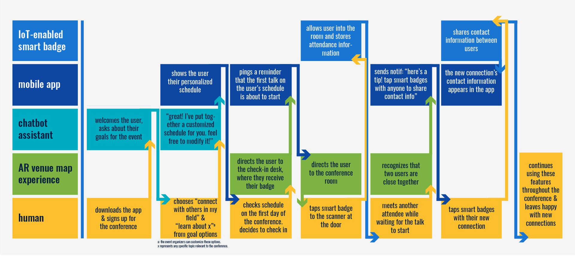
Multi-Modal Flowchart:

Target User:
Google Converge's target audience falls into two main categories: event organizers and event attendees. The target event organizer is a tech-savvy working professional who routinely coordinates large events. Their primary goals are to streamline the event management process, increase attendee engagement, and gather actionable insights from events. They are motivated by the need for a reliable, comprehensive tool that simplifies coordination, enhances attendee experience, and provides robust data analytics for post-event evaluation.
The target event attendee includes business executives, academic researchers, and industry enthusiasts who seek to maximize the value they gain from events. Their goals include networking with peers, discovering new trends and innovations, and gaining knowledge relevant to their fields. They are motivated by the desire for a seamless event experience, where they can easily navigate venues, connect with the right people, and access event information effortlessly.
Design Feedback:
After finishing my initial demonstration video, I showed it to two non-designers to get feedback; I did not tell them anything about the project beforehand. My objective in doing this was to see whether they would understand the concept of the connected experience, what its different components were, and what the purpose of the proposed product was. I should also note that I showed the video to them seperately, so their feedback would not influence each other.
Both individuals had a great grasp of what the product was right away. One person even said "this is exactly the kind of video Google would make to announce something like this," which I took as a success. One helpful critique I got was that it wasn't clear how the smart badges share information between users. To address this critique, I added a video demonstration of the user information page that would appear on the app when two users tap smart badges, and I edited my video to make a clearer connection between the badges and the app. Overall, both people understood the product and agreed that the video clearly showcases my design concept.
Video Demonstration:
Project Retrospective:
What was most challenging about creating a connected UX product concept?
Although this project was very rewarding for me, it also posed some challenges! I have never worked on designing multiple digital products that work together before, so it was initially difficult to figure out how all of my components should work together. The internet-enabled smart badge was my driving idea for this project, and I had a pretty strong concept of what I wanted to do with it and how it would connect to a mobile app. However, I had some difficulty piecing together how to incorporate an AR experience into my idea.
What part of this project did you enjoy most? What part of this project did you enjoy least?
I got the most enjoyment out of the research, ideation, and video creation stages of this project. Since I want to focus on UX research in my career, it makes sense that I would feel most excited about all the research! For the same reason, designing the app user interface was the least enjoyable part of this project for me.
How was your creative process challenged by this project? What were the similarities in how you approached this project and other digital design projects? What were the differences?
I was challenged by keeping track of all the different parts of the connected experience, and working out how they fit together to create the best product. I was also challenged by the bredth of this project, since I was tasked with research, ideation, designing multiple interfaces, and creating a demo video. I naturally felt more comfortable with certain aspects of this project more than others. Although this project was different than what I have worked on before, I used similar strategies like keeping a comprehensive project document to write down notes and developments. I also approached much of the research in the same way I usually do, by first identifying a problem and seeking out potential solutions. I approached this project differently than others by focusing much less on segmenting the different steps. Usually, I work best by isolating different tasks. However, the interconnected nature of this project required that I work on multiple things at once.
What new challenges did you face when communicating and prototyping your connected UX product? How did you overcome them?
Designing a video that accurately communicated what Google Converge is all about was one of my favorite parts of this project. Although it was challenging to figure out how to show how all of the pieces went together to create the larger experience, I enjoyed the puzzle! I faced this challenge by going crazy all over my whiteboard with video ideas until eventually I had a sequence in mind.
Between designing for digital and designing a connected experience, which do you prefer? Why?
This is a difficult question, because I think there are lots of aspects of both that I enjoy. However, if I had to choose one I would say I prefer designing for a single digital product. I enjoy being able to really focus in on something, and the bredth of this project made that difficult.
For this project, you had to simultaneously focus on original concept, physical/digital interaction, and movie magic. How did you juggle those responsibilities? Which were your strengths? Which can you improve on, and how will you work on those areas of improvement in future projects?
I heavily prioritized the concept creation, research, and video demonstration in this project, and so I think my execution of the prototypes could use some more love. In future projects, I will work on this by improving my time management and allocating more time to prototyping! I feel most confident about my research and creation of an original concept for this project. I believe those are always my strong suits, and I feel happy about the concept I created for Google Converge. I think this is a product that would genuinely make conference experiences better.
References
CDW Expert. (August 18, 2023). RFID vs. NFC: Which is Right for Your Business? https://www.cdw.com/ content/cdw/en/articles/networking/rfid-vs-nfc.html#:~:text=NFC%20is%20best%20described%20as, limitations%20of%20its%20radio%20frequency.
MuleSoft. (n.d.) What is an API? https://www.mulesoft.com/resources/api/what-is-an-api.
Wojciechowski, Sebastian. (September 5, 2023). How to Develop Augmented Reality in Mobile App. https://www.netguru.com/blog/augmented-reality-mobile-app-development.


UX Designer & Student.