ChatGPT App Critique
INTRODUCTION (WHAT IS CHATGPT):
The ChatGPT app allows users to access and chat with OpenAI’s GPT-4 large language model (LLM) from their phone. Just in case you’re not familiar with what it does, the model uses artificial intelligence (AI) to interpret the user’s input and generate conversational responses to almost anything you can think of. Although many of us are very familiar with ChatGPT, which was released to the public on November 30, 2022, some of us (or maybe it was just me) didn’t realize there was an app until recently. The ChatGPT app launched for iOS and Android this past spring (May and July 2023), and has already reached over 110 million installs (Malik, 2023). The app takes an already astounding technology to the next level, as it presents the ability to easily talk with ChatGPT from anywhere at any time on your phone. In this review, I will critique the ChatGPT app’s user experience (UX) design and provide suggestions on how it can be improved.
WHO IS IT FOR?
Before we get into the critique, we should understand who the app is built for. According to this review, the majority of ChatGPT users are between the ages of 25-34 years old, and 80% of users are under the age of 45. The majority (56%) of users are male, and more users live in the United States than any other country (Mahajan, 2023). Many individuals and companies are using ChatGPT to speed up tasks and make their workflow more efficient. Although ChatGPT has a massive audience (the website has over 1.5 billion visitors per month) these statistics suggest that the target audience for the app is young male professionals living in the US (Mahajan, 2023).
OVERALL IMPRESSIONS:
The ChatGPT app has successful design in many ways, although there are some missed opportunities and several key issues with things like hierarchy. It has an uncomplicated design that uses consistent components, making it straightforward for users to learn how to interact with the app.
(MIS)USE OF SPACE:
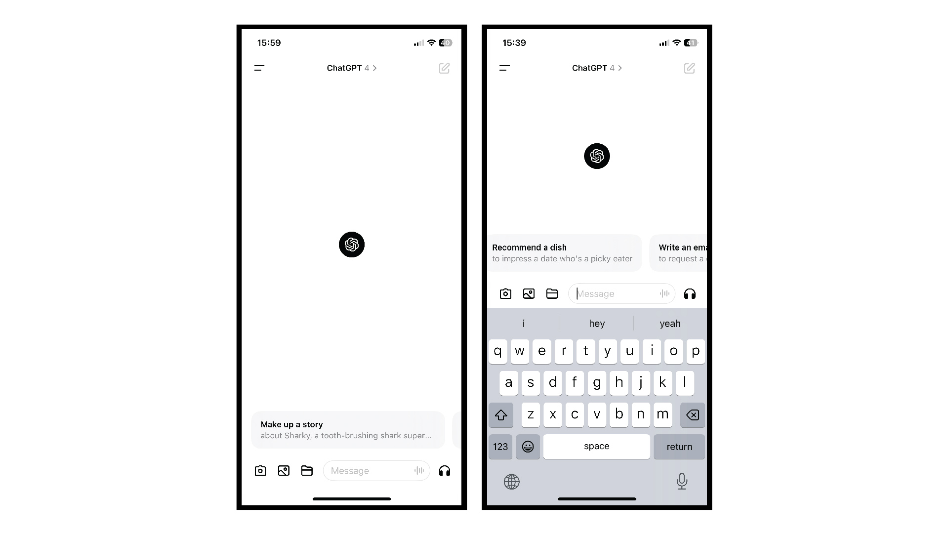
After onboarding, the user is greeted with a new chat and some suggestions for what they might ask, which is helpful for both new and returning users to get the most out of the application. However, there are some missed opportunities here. The chat suggestions are long and each one takes up almost the full width of the screen, resulting in the user only seeing one at a time. Meanwhile, the rest of the page is practically empty. That free real estate could be used for displaying more chat prompts, which would help users get new ideas about how to benefit from what the app can offer. The excess blank space may be intimidating to new users who are not familiar with ChatGPT, since it leaves most of the decision making up to them for what to do next.
INFORMATION ARCHITECTURE OPPORTUNITIES:
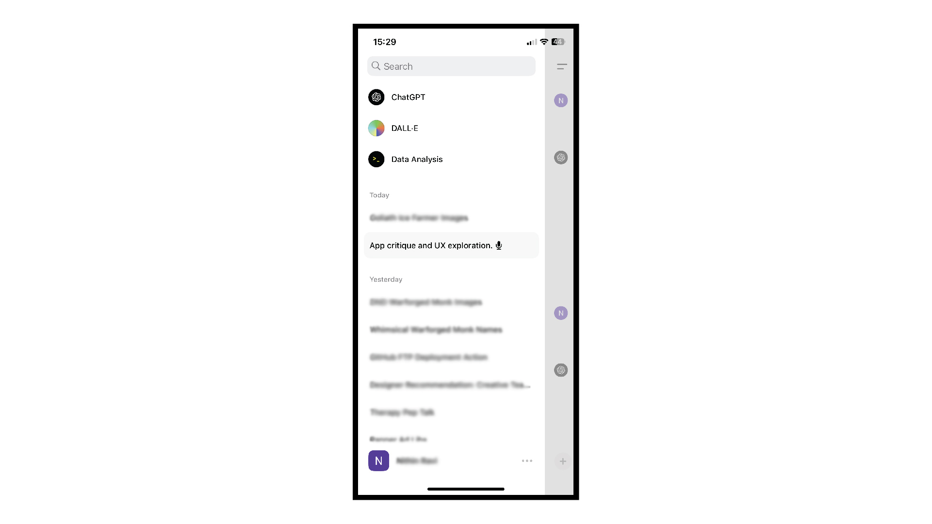
The menu on the left-hand side provides access to all of your past conversations, and is straightforward and simple to navigate. The search function at the top allows for an easy way to locate old conversations… in theory. However, in reality it can be hard to find an old conversation if you don’t remember what it’s called. If you have been a user for a long time and have hundreds of conversations in your history, it’s frustrating to realize that there’s no way to archive or categorize your conversations. This could be addressed by adding the ability for users to put their conversations into folders.
SUCCESS WITH MICRO-INTERACTIONS:
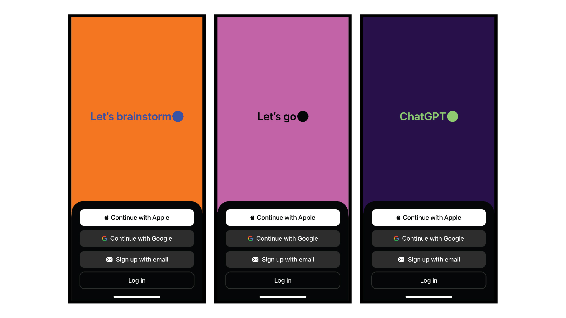
The ChatGPT design excels at incorporating micro-interactions to make the experience more intuitive and engaging for users. My personal favorite appears at the beginning of the onboarding flow; the user is greeted with changing phrases like “let’s explore,” “let’s create,” and “let’s design,” and while the words appear and disappear, the phone subtly buzzes to the rhythm of the letters. This small interaction brought a big smile to my face. It immediately engages the user, bringing their experience of the app out of the digital and into the physical realm. Additionally, it ensures that the user remains interested in the screen long enough to move on to the next step.
Similarly, when ChatGPT is typing out a response to a query, the phone very subtly buzzes along with the words. This provides a tactile and dynamic user experience, and helps encourage user satisfaction. As a user myself, it makes me excited to use the app because of the delight I get out of the phone buzzing along to the words.
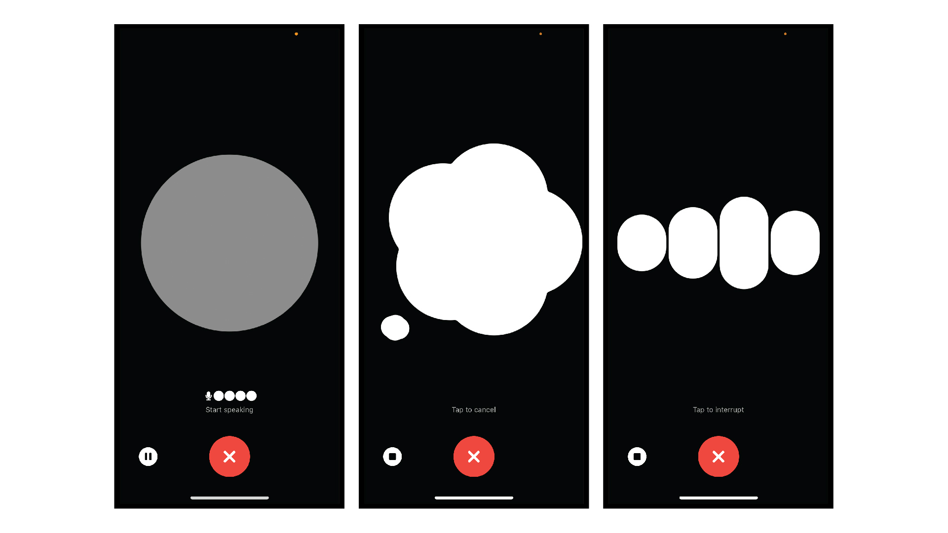
Yet another successful micro-interaction is found in the Voice functionality. This is a new feature that the app very recently rolled out, in which users can directly talk to ChatGPT and get answers spoken to them out loud. When you tap into the feature on the app, you’re greeted with a full-screen UI that visualizes the conversation. The screen changes based on whether ChatGPT is listening, thinking, or speaking, and there’s constant small movements no matter what state it’s in. These movements make it feel like you are actually being listened to.
USE OF COLOR AND TYPE
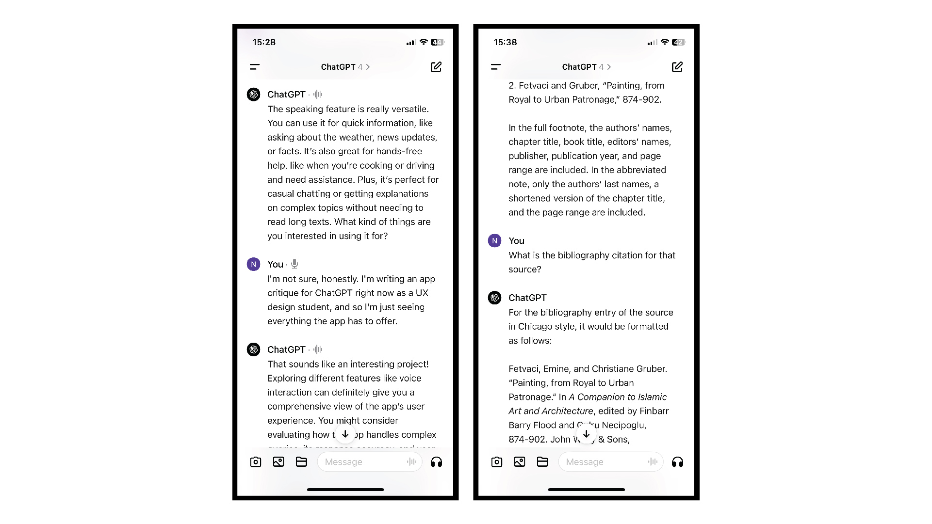
There are key places where color or typography could be used better to help with user experience. For example, when scrolling through a long conversation, it’s difficult to discern between my queries and ChatGPT’s answers. There are no color or typographic differences between the user input and ChatGPT’s responses, and the only thing that differentiates them is a label at the beginning of the query/response. This makes it hard to easily find a specific place in the conversation that I want to refer back to.
One way to address this issue would be to use color to differentiate between questions and answers. A great example of this is how iMessage conversations are designed with your texts in blue and the other person’s texts in gray.
CONCLUSION:
Overall, the ChatGPT app is simple to use and has a straightforward design. However, the user experience could be improved by better utilizing color, space, and information architecture.
References
Mahajan, Viraj. (October 13, 2023) 100+ Incredible ChatGPT Statistics & Facts in 2023 https://www.notta.ai/en/blog/chatgpt-statistics#chat-gpt-users.
Malik, Aisha. (December 13, 2023). ChatGPT: Everything you need to know about the AI-powered chatbothttps://techcrunch.com/2023/12/13/chatgpt-everything-to-know-about-the-ai-chatbot/.


UX Designer & Student.